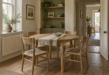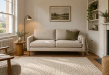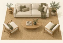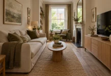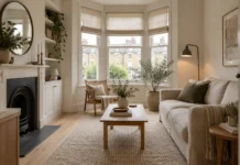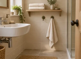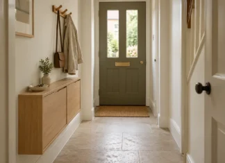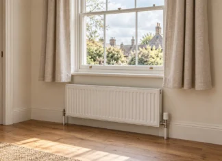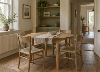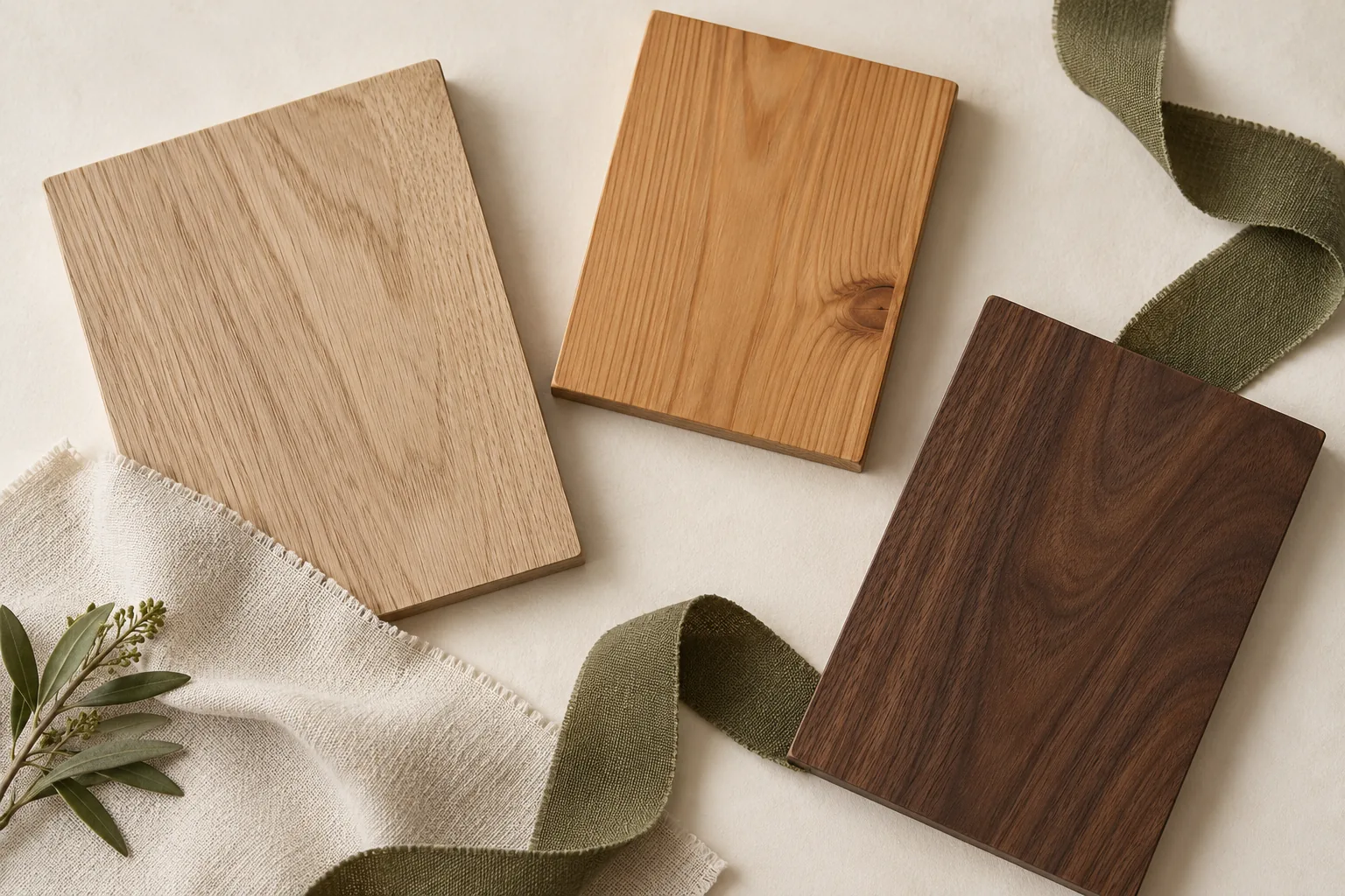
An oak floor, a walnut sideboard and a pine table do not need to belong to the same furniture range to look comfortable together. Mixed woods can give a room the depth and character that matching sets sometimes lack.
The difficulty usually comes from judging each item separately. A side table bought online may be lovely on its own yet seem oddly orange beside the sofa. Look at the relationship between the pieces: their colour, finish, shape and the amount of each material you see.
Start with the largest fixed surface
Flooring, kitchen cabinetry and built-in shelves are usually the least convenient things to replace. Use them as the background for new decisions. An oak floor covers a much larger area than a pair of chair legs, so its colour will have more influence even if the chair is the newest purchase.
Notice whether the floor looks pale, honeyed, reddish, greyed or dark brown in the room’s actual light. Also consider how much grain you can see. A strongly patterned floor and an equally busy tabletop may need a plain rug between them to create some visual breathing space.
Do not rush to change the floor because one new piece does not quite work. Moving the piece onto a rug or away from the wall colour may change the relationship enough to make it feel intentional.
Compare the finish rather than the wood name
Two products labelled oak may look very different. Colour and grain vary within timber species, a point illustrated in WOOD magazine’s explanation of matching and contrasting woods. A finish can change the appearance further.
Ask for a real sample where possible. Place it horizontally beside the floor and vertically beside existing furniture, because light catches the surfaces differently. Check it in the evening as well as near the window. Online images are useful for shortlisting, but a screen is a poor tool for approving an exact match.
With second-hand furniture, inspect several parts of the piece. The protected underside and the exposed top may differ. Decide whether you like its present appearance before making a plan that depends on stripping or refinishing it.
Give one timber the main role
A useful editing approach is to choose one main timber and allow another to provide contrast. This is a design preference, not a rule about percentages or an official limit on how many woods you may use.
In a living room with a pale oak floor, for example, a dark brown sideboard could be the deliberate contrast. A chair with similarly dark legs can repeat that note without requiring every table to match. Cream upholstery and a quieter rug can connect the larger surfaces.
Compare that with a room in which the floor, dining table, coffee table, shelves and sideboard each have a different strong orange or red finish. You may enjoy the collected effect. If it feels unsettled, simplify one prominent surface first rather than replacing all the furniture.
Three combinations to test
Pale oak, dark brown timber and warm white
Let the oak floor provide continuity, add one substantial dark piece and keep nearby fabric relatively quiet. A dark picture frame can echo the deeper timber without adding another furniture footprint. Check that the dark finish looks brown in your light if that is the effect you want.
Honeyed pine, painted cabinetry and muted green
Painted furniture can create a pause between several wood surfaces. Try a subdued cabinet colour alongside the pine rather than attempting an almost-match in another timber. A muted green textile can give the scheme an additional point of connection.
An inherited sideboard with contemporary furniture
Give the older piece space to be itself. Pair it with a simpler table or chair silhouette, then connect the room through upholstery, artwork or lighting. You do not need to introduce another antique simply to justify the first one.
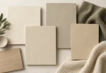
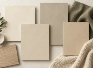
Compare the timber samples beside tested warm neutral paint colours rather than judging either material on its own.
Use rugs and upholstery as useful intervals
When a table and floor are close in colour but visibly different, a rug can separate their edges. The eye can then read them as individual pieces rather than an unsuccessful attempt at matching.
The same principle works vertically. A fabric chair beside a timber cabinet creates an interval between two large wooden objects. The fabric does not have to be neutral: choose a colour that belongs to the wider scheme and is practical for the room.
Keep the rug’s size in mind. A small mat directly beneath a large table may introduce another awkward edge. Use enough area to make the separation clear and check that chair legs and doors can move safely over it.
Our living room rug measuring guide helps you make that textile interval large enough to relate to the furniture.
Look at shape and sheen too
A rounded, highly polished table and a rough, angular cabinet differ in more than colour. Sometimes that contrast gives the room personality. Sometimes several different finishes and silhouettes compete for attention.
If the room feels busy, choose which contrast you want to keep. You might retain contrasting timber colours but use simpler shapes, or keep varied furniture profiles within a quieter range of finishes. Take a photograph from the doorway and identify the first three things you notice.
Before changing a finish
Confirm whether the surface is solid wood, veneer, laminate or another material. Do not assume that a thin decorative surface can tolerate sanding. Follow the furniture and finish manufacturers’ instructions, and seek specialist advice before altering a valuable or sentimental piece.
Often the least disruptive adjustment is enough: a different wall colour, a larger rug or moving the sideboard away from a competing table. Our guide to styling vintage furniture explores the wider mix, while sideboard styling can help make an existing piece feel properly at home.