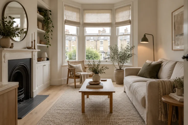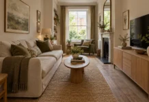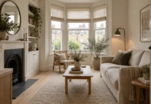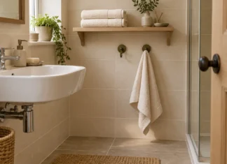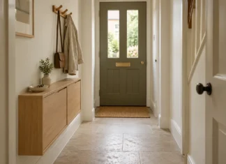
A paint colour that looks gentle and creamy in a shop can turn surprisingly grey at home. In a north-facing living room, the light reaching the walls is often cooler and less direct, making undertones more noticeable.
Warm neutrals are a useful place to start, but they are not a promise of brightness. The best choice depends on the windows, surrounding buildings, floor, upholstery and the hours when you use the room. Choose a colour for the light you have, then build the rest of the scheme around it.
Look at the room before the paint chart
Check which windows provide the main daylight. A room may face north yet also receive light from a side window. A deep window reveal, large tree or building opposite can matter as much as the compass direction.
Spend time in the room in the morning, afternoon and evening. Notice which wall looks flattest, where the floor casts reflected colour and whether the sofa sits in shadow. Photographing the space can help you compare changes, but the camera’s colour correction should not replace looking directly.
Dulux’s room-orientation guidance suggests warm undertones for north-facing rooms, including whites and greys with pink, yellow or gold notes. This is a useful shortlist method rather than a reason to rule out every cooler colour.
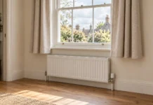
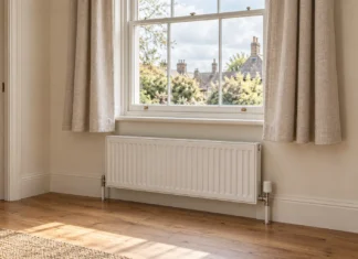
Window treatments influence how that daylight enters the room. If a radiator sits beneath the window, consider these curtain length and layout options alongside the paint samples.
Try warm off-white when you want a quiet background
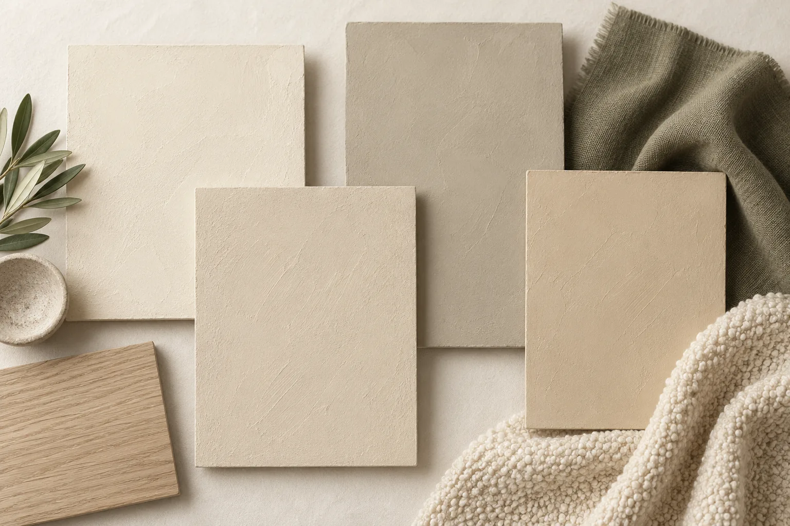
An off-white can keep the room visually simple while avoiding the starkness of a brilliant white beside warm furniture. Compare a creamy version with a more mineral, stone-like shade. One may flatter the flooring while the other makes it look unexpectedly orange.
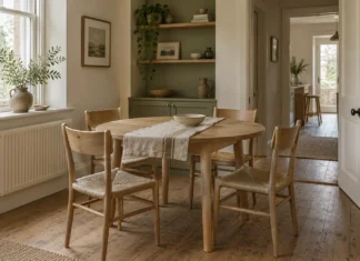
Use the existing sofa as a reference. If its fabric is a soft oatmeal, a sharply cool white may make the upholstery look yellow. A warmer wall colour can create a gentler relationship, but too much cream may feel heavy in a room with already yellow timber.
Keep the sample beside the skirting and ceiling colour as well. An off-white can look clean on its own and muddy next to a much brighter trim. Testing the combination is more useful than judging either paint in isolation.
Consider stone, putty and taupe
A slightly deeper neutral can give a north-facing room more presence without turning it dark. Stone and putty shades can sit well with linen, leather and timber, while taupe can offer a softer alternative to a blue-grey.
Check the undertone carefully: the name stone tells you very little about whether a paint will look pink, green or violet in your room. Place several candidate samples alongside each other briefly to reveal the differences, then assess the strongest one on its own.
For a scheme with oak flooring and a beige sofa, try a warm mineral wall colour, an olive accent and a darker timber detail. This is an illustrative palette, not a claim that those materials always share compatible undertones.
Use a muted plaster pink if beige feels too flat
A restrained, earthy pink can act as a neutral beside brown leather, oak and cream. The aim is a colour with enough softness to sit behind the furniture, rather than a sugary accent spread across every wall.
Test it beside red or orange woods particularly carefully. You may enjoy the warmth, or find that the combination makes the whole room too rosy. A green or charcoal textile can introduce contrast without requiring a second wall colour.
If you prefer a paint-brand starting point, Dulux lists Jasmine White, Summer Linen and Perfectly Taupe among its suggestions for north-facing rooms. Treat them as candidates to sample, not shades that have been tested in your home.
A darker room can still be a successful room
If you mainly use the lounge after dark, you may prefer to make it feel enveloping rather than chase a brightness it rarely receives. A deeper brown, olive or earthy red could suit that intention. Sample it across the walls you see from your favourite seat and consider the ceiling and woodwork at the same time.
Separate the visual warmth of a colour from the actual temperature of the room. Paint does not fix draughts, insufficient heating or poor insulation. Choose it for atmosphere, with lighting and comfort addressed in their own right.
Test paint as a material, not a screen colour
Paint substantial sample boards using the maker’s recommended preparation and number of coats. Let them dry, then move them between the window wall, the darkest corner and the wall behind the sofa. Keep a border of plain paper nearby if the existing wall colour is distorting your judgement.
Check the shortlist under the lamps you intend to use. A colour chosen in daylight may look different under your evening bulbs. If replacing lamps is part of the project, make that decision before ordering a room’s worth of paint.
Review the finish as well as the colour. A washable product might suit a busy family lounge, but sheen and preparation requirements vary. Follow the individual product’s instructions rather than assuming that every paint described as matt performs identically.
Finish with contrast and texture
A warm neutral room can look unfinished when every object is almost the same value. Add a darker picture frame, a textured rug or a timber table with enough contrast to register against the floor. Keep what you enjoy looking at, then edit the pieces that compete.
Our guide to building a room’s colour scheme offers further ideas beyond the living room. For a calm, natural-material approach, explore Japandi style, taking the principles into your room without expecting a photograph’s colours to reproduce exactly.
Bring the floor and furniture into the same sample exercise using our guide to mixing wood tones. For a complete restrained scheme, see our Scandinavian living room ideas.
Further Reading